Friday, 16 December 2011

3 front pages

The Q masthead is placed in the left top corner as usually for Q magazines which makes it recognizable very easily. Editors decided to use sexual design for this issue to attract more male audience through choosing a topless model and writting "sexy beast" as as title.The main photo is long shot. The front cover designed very well as we can see all titles clearly and easily understandable. From the main title we can guess that the main article will be about Lily Allen becuase it is the biggest title on the page . The two black panthers represent characteristics of the singer as a dangerous woman. I would say that audience of this issue are male 17+ mostly but also there are some intresting topics for female as well. To attract more audience there is an exclusive interview, reviews and sticker on which says "The 25 greatest rock movies". The colours used are blue, red, white and black.

XXL magazine always use the same masthead for every issue, so it became very famous and easily recognizable. The picture covers up a lit bit of the XXL logo but it isn't a big deal because audience will recognize it anyway. Magazines always put a picture of a singer about which the main topics will be about and in this on is Lil Wayne. He is one of the symbols of Hip-Hop/Rap music our days so he is shown in close up as a cool person with lots of tattoos and angry facial expression. The background is a white wall which doesn't attract attention but colourful titles change it. The colours used for titles are blue and black which suits the white background very well. The XXL logo is red and it makes it highlighted. The audience of this issue are male and female 15-25 because in Hip-Hop teenagers and young adults are intrested mostly. For people who doesn't like Lil Wayne there a list of singers which are in magazine as well.                              

The NME is slightly different from previous magazines that I have analysed. It looks more busy as there are more titles on the front cover. The front page is using attractive colour red to look more professional but it looks less intresting because of one colour and it doesn't look colourful. The logo of NME is large and red as well.The main image is a mid shot of two people which takes up part of the masthead, but the magazine is famous so people can make up the rest of the logo. The main articles will be about Alex Turner and Miles Kane because their names are highligthed in white colours which looks different from all titles. NME is a kind of magazine where all styles of music are included as we can see on the left side there are titles about different singers and each of them has his own style of music. SXSW special will attract audience as it says that they are 12 new bands to be intrested in and Rolling Stones exclusive. The audience of this magazine are male and female 17-28. 

All three magazines have the same style of putting barcodes of pages; bottom corner, left or right side.       


Monday, 12 December 2011

InDesign


My first time using Adobe InDesign to create DPS. My first task was very easy to do but next tasks will be more complicated and harder to do.

Friday, 9 December 2011

Comparing magazines

I am comparing 4 magazines (The Clash, Q, Record Collection, Metal Hammer). All of them are based on music and research about it.
  • The Clash
It is the most expensive one from all of them, it costs £5.99 and a number of pages is 146. The Clash is about one music band called ''The Clash'' and it is published by Uncut and Sonic Editions. It contains one section about the same band; history, interviews, stories and lots of photos. To make people buy this magazine, editors have written some exclusive interviews. Also to advertise another products, Uncut have shown different covers of another issues. A design of the magazine is a rock style and it looks very nice.

  • Q
Q is the most famous one from all of them. A price is very cheap, comparing to a number of pages, it costs only £3.99 and the number of pages is 162. It has 3 sections; features, regulars and the Q review. To advertise the magazine editors have included very attractive titles, like 50 albums of the year, 12 hot new artists and very popular topic about Amy Winehouse. As well Q is published monthly in UK and the publisher is Bauer Media Group. A cover of the newest issue looks very nice and attractive. Q is based on different styles of music and mostly modern.

  • Record Collection  
Already looking on a cover we can see that publisher decided to use Christmas style in a masthead, style of texts to attract more buyers by Christmas Issue and a chance of winning a special album. A magzine costs £4.00 and a number of pages is 146. It has 3 sections features, regulars and review. Editors published mostly all topics based on Christmas like 31 excellent xmas songs. Also one of topics is a cover story: Led Zeppelin. The publisher of Record Collection is Diamond Publisher. Overall the magazine looks very nice, it contains good photos and texts.

  • Metal Hammer
From the masthead we can guess that a magazine is about hard rock or even heavy metal. Also just next to the masthead it says that it is the biggest issue ever with 188 pages which will attract more people. Metal Hammer has 1 section about rock music singers. When we check the contents page we find out that the magazine contains 72 interviews, 87 reviews, 233 gig listening. The magazine is published monthly by Future Publishing. Typical articles; The Devil's Blood, Megadeth and Defenders of the faith.
 

Action Plan

5.12.11
  • Write action plan
  • Compare magazines
  • Textual analysis (3 front covers, 2 contents pages, 2 DPS)
2.1.12
  • Audience research (polls, questionnaires, theory)
  • Internet research (institutions, readership figures)
16.1.12
  • Plan photoshop
  • Take photos (using camera)
30.1.12
  • Layout designs
  • Masthead design (dafont.com)
  • Make pages (photoshop, publisher)
6.2.12
  • Drafting
  • Audience feedback (questionnaire about pages)
  • Evaluation
Deadline 2.3.12

Deadline

Our deadline is on 2.3.12 so we have plenty of time to do our task, and I am starting to do now )

Good news

I have finished my first task, and from now on I am starting to do my main task, which includes a front cover, contents page and DPS.

Thursday, 1 December 2011

Contents page

Here is my design of the contents page. I have included texts, page numbers, photos, title, also I have written a school website and included the title of the magazine.

Final cover

I have made some changes, like additing more texts in the left corner. Also I wrote on the cover that readers have a chance of winning an IPod so they will be more intrested in reading the magazine.  

Monday, 28 November 2011

Friday, 25 November 2011

Thursday, 24 November 2011

My final design of a title

My final design for a magazine title. I have changed the style of writting but the shape stayed same. I think the title will look good on a cover of a school magazine, where mostly teenagers will read it and it will attract their attention.

Contents

Here are my drafts for a content page. For 1 design I have included a title, page numbers and simple photo. But 2 draft looks better, because I have added more pictures so it looks more professional and intresting.

Covers

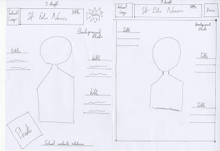
I have designed 2 drafts for my cover. My first one containts a title, a school logo, background photo, some titles. But my second draft has developed a little by adding more photos and a school webside address. Also I have changed a shape of a price logo.           

Monday, 21 November 2011

Please write in comments which title you prefer more

Photoshop, second task

My second task was to make a cover for a magazine, but very simple. I started from choosing picture, after I copied it and pasted to a new picture. And in the end I changed colour, size and added some effects.


Friday, 18 November 2011

Poll results

So after 2 weeks I checked my poll and I found out that 'St'Eds News' wins as a name for my magazine. It got 3 votes and it is 42%. Overall 7 people voted and St'Eds News are their favourite.

Thursday, 17 November 2011

Photoshop


Today we learned how to use Photoshop and all tools and functions. Our task was to make a cover for a cooking book. So we started from changing background colours, after we moved lemons and in the end we made a title. It was my first time using Photoshop and I liked it.       

Monday, 14 November 2011

Context page analyze

Here is example of a context page of the same magazine. Style of the page is very simple, background colour is simply white but at same time it looks better like this because on white it is easier to see all texts and pictures. All texts are same style and colour, only some titles are orange. Also their masthead is represented on the page and the photo from the cover.

Analyzing school magazines


My first example of a school magazine cover is a magazine which is called 'The Indian Student'. From a masthead we can already guess that the audience of this magazine are indian students which are studying abroad or are going to. It is published four times per year and distributed at exhibitions in India as well as database of Indian students searching for a course. The brand Identities of this magazine are colours of titles which are colour of Indian flag, orange and green. On the front cover we can see 4 main atricles in this magazine, so students will be more intrested in reading it, because they know what is inside. Also on the front cover in bottom part we can see a website of this magazine, so it is easier to fing out more about studying abroad. The model for the magazine is a casual student and he is wearing casual as well.


Thursday, 10 November 2011

Name for the magazine

Please vote everyone )

My Action Plan

I have decided to create an Action Plan, so I can see what I need to do

Part 1
- Set up a blog
- Write an action plan
- Create a poll
- Create questionaires

Part 2
- Analyse at least 2 students magazines
-Make drafts for my magazine
- Create a design for my magazine

Part 3
- Take photos
- Photoshop
-Add them to my blog

Part 4
-Evaluate final pages

First Task

Hey world!!! So today we are starting to do a new task for AS Media Studies. And our new preliminary task is to make a school/college magazine. I am expected to be using DTP and Photoshop. The magazine must contain a photograph of a student plus some texts and of course some pictures.